Tech Stack
Typography
Color Palette
Overview
A complete reimagining of MAIZ with an entirely different design direction — warm, playful, and maximalist. Inspired by Feastie.ca's bold approach to restaurant web design, this version embraces organic shapes, earthy tones extracted from real brand photography, and a friendly, approachable personality.
The Ideation Process
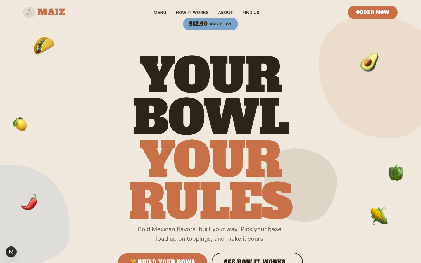
This project started with a fascinating design challenge: same brand, completely different visual language. After building Casa Fuego with its editorial, luxury-casual approach, we asked ourselves — what if we went the opposite direction? What if instead of sophistication, we leaned into pure playfulness and warmth? The inspiration came from Feastie.ca, a restaurant platform known for its maximalist, sticker-book aesthetic with oversized type, organic shapes, and vibrant color blocking. But we didn't want to just copy the style — we wanted to ground it in MAIZ's real-world brand identity. So we took actual photos from the MAIZ restaurant and extracted the exact colors: the terracotta of their clay serving bowls (#C87148), the dusty blue of their wall tiles (#7BA4C9), the olive green of their fresh ingredients (#5E5E30), and the warm cream of their interior (#F0E8DC). Every color in this site exists in the physical restaurant. The font choice was equally intentional — Alfa Slab One has this chunky, rounded personality that immediately says "friendly neighborhood spot" rather than "upscale dining."
Design & Development
The design process was an exercise in controlled chaos. We wanted maximalist energy without visual overload. The hero section features floating food emojis (tacos, avocados, peppers, corn) with two different float animation variants — one at 5 seconds and one at 6 seconds — creating an organic, never-quite-repeating pattern. Behind the content, three blob shapes continuously morph between organic forms over 8-12 second cycles, adding life without demanding attention. The "How It Works" section uses 4 cards with exaggerated asymmetric rounded corners (24px on three corners, 60px on one) — this small detail gives each card a playful, hand-crafted feel. Each card wiggles on hover with a custom CSS animation. The review section uses a bento grid layout where the first card spans two columns, creating visual hierarchy. We recreated the MAIZ corn badge logo as a hand-traced SVG — a circular emblem with corn stalks, radiating rays, hands, and the tagline "Trust in the food we love." This was one of the most meticulous parts of the project, requiring careful SVG path work to maintain the charm of the original while making it scale perfectly on screen.
What Makes It Unique
Real brand colors extracted from physical restaurant photography — terracotta from clay bowls, dusty blue from wall tiles, olive from fresh ingredients, warm cream from interior walls
Organic blob morphing animations with 3 shapes cycling between forms over 8-12 second durations — adds life without demanding attention
Floating food emojis with two animation variants (5s and 6s cycles) creating non-repeating organic motion patterns
Asymmetric rounded corners (24px/24px/60px/24px) on cards that give each element a hand-crafted, playful feel
Custom card-wiggle CSS animation on hover that makes interactive elements feel alive and responsive
Bento-style review grid with asymmetric card spanning — first card takes 2 columns for visual hierarchy
Hand-traced SVG corn badge logo recreation — circular emblem with corn stalks, radiating rays, and tagline
AnimatePresence for smooth category transitions in the menu filter with proper exit animations
Technical Highlights
- Tailwind CSS v4 with modern @theme configuration for design tokens
- Custom CSS @keyframes for blob-morph, float-food, float-food-alt, and card-wiggle
- SVG logo recreation from raster reference — hand-coded paths for perfect scalability
- Custom food photography for 8 menu item hero images
- Structured content.json with all color and font values as editable tokens
The Result
MAIZ proves that the same brand can live in completely different visual worlds. Side by side, Casa Fuego and MAIZ share the same menu and content but tell entirely different brand stories — one says "treat yourself," the other says "come as you are." This is exactly the kind of range we want to show clients: your brand isn't locked into one visual language. Having two distinct portfolio pieces for the same restaurant demonstrates our versatility and our understanding that design is about strategy, not just aesthetics. The real-world color extraction process is something we now use in every project — it creates an instant emotional authenticity that chosen-from-a-palette colors simply can't achieve.
Want something like this?
Every project starts with a conversation. Tell us about your brand, your goals, and your timeline — we'll handle the rest.